The fastest way to look like a real brand is to look like the same brand twice in a row. Most early-stage teams fail this test — every post is a different font, a different shade of blue, a different idea of what the logo should do.
A brand kit isn't a vanity exercise. It's the constraint that makes generative tools usable. Without one, AI gives you a different aesthetic every time. With one, every prompt is implicitly anchored to your colors, fonts, spacing, and tone.
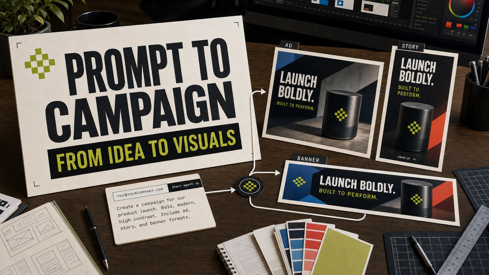
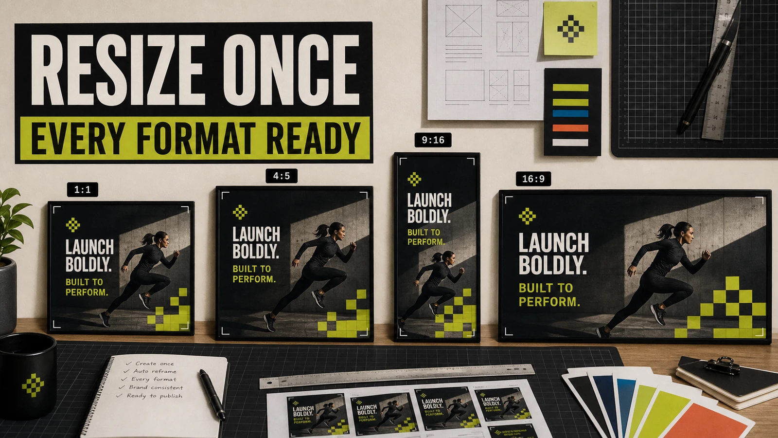
Studio's brand kit takes 15 minutes to set up and changes everything downstream. Once configured, every prompt — whether it's a launch ad, a story cover, or a website hero — pulls from the same visual grammar. The output stops looking like 'AI art' and starts looking like your brand.
What to put in your Studio brand kit
- 01Primary, secondary, and accent colors (with HSL values, not just hex)
- 02Display font + body font + a fallback for each
- 03Logo lockups — full, mark-only, dark mode, light mode
- 04Spacing scale and border radius defaults
- 05Voice notes — tone slider, words you do and don't use
- 065-10 reference visuals you'd be proud to call your own
Turn this into a working AI campaign visual workflow.
Use the article as the strategy layer, then connect it to Taploop for audience selection, campaign execution, attribution, and follow-up. The SEO goal for this page is to answer the searcher's practical question and route them to the product surface that can run the workflow.